Overview
BusiPilot is a product-style web app that helps small teams capture goals, break them into actionable items, and stay oriented—without forcing everyone into heavyweight project management. I owned the front-end architecture, core UX flows, and performance-sensitive UI patterns.
Role
Product engineer · UI architecture
Problem
Operators and founders were juggling notes, spreadsheets, and ad hoc tools—so priorities drifted and handoffs broke down. The product needed an interface that feels lightweight on day one but scales as workflows grow.
Solution
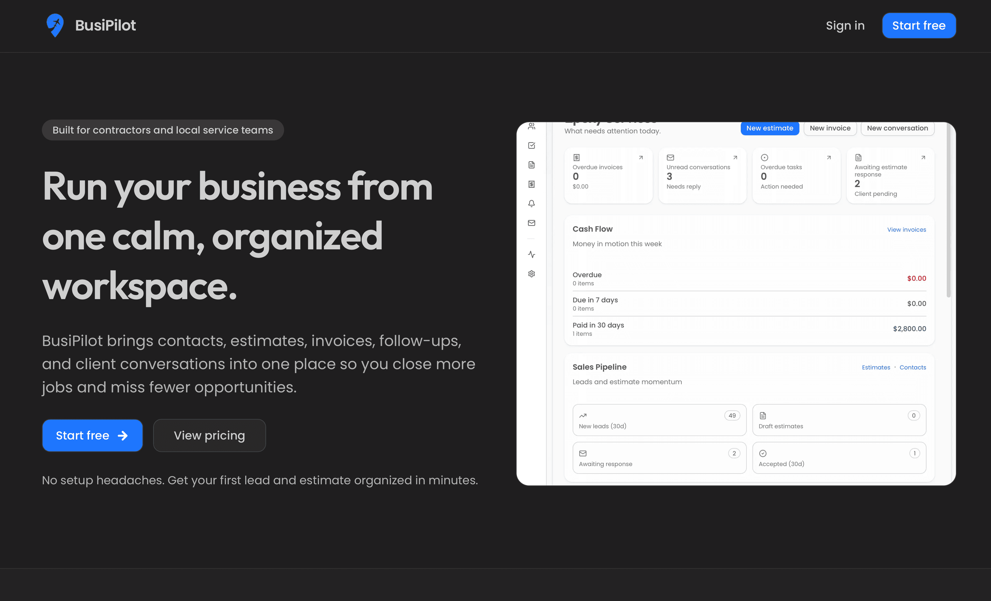
Shipped a responsive app shell with predictable navigation, task-centric views, and optimistic-feeling interactions so people can log in, capture work, and resume context quickly. Emphasis on readable typography, tight information hierarchy, and keyboard-friendly targets for daily use.
Key features
Dashboard that surfaces active work and stalled items at a glance
Structured task capture with flexible grouping (no rigid methodology lock-in)
Responsive layouts from mobile check-ins through desktop deep work
Motion used for state changes and hierarchy, not decoration
Foundation for role-based views and integrations as the product matures
Technical highlights
- Next.js App Router with shared layouts, loading boundaries, and colocated UI modules
- Reusable component primitives (panels, badges, list rows) with consistent spacing tokens
- Client islands only where interactivity is required; lean server-first defaults
- Image and font discipline aligned with Lighthouse-style performance goals
- Type-safe props and domain-shaped models to reduce UI drift as features land
Challenges & mitigations
Challenge
Keeping the app approachable for non-technical users while leaving room for power workflows.
How we approached it
Defaulted to simple create-and-complete loops, progressive disclosure for advanced fields, and copy that mirrors how teams talk about work—not software jargon.
Challenge
Avoiding the “empty product” feeling on first use without fake demo data permanently in the database.
How we approached it
Used thoughtful onboarding empty states, suggested starter structures, and clear CTAs that teach the model of the app in one session.
Challenge
Maintaining snappy interactions when lists and history grow.
How we approached it
Structured list rendering around stable keys, pagination or windowing where needed, and deferred loading for non-critical panels.
Results & impact
Framing below stays qualitative on purpose—swap in concrete numbers only when you can cite them.
- A coherent v1 product surface teams can adopt without a training manual
- Clearer day-to-day orientation for pilot users versus scattered notes (qualitative)
- A codebase structure ready for auth hardening, billing, and integrations
- Reduced UI inconsistency through shared primitives and tokens