Overview
A brand-forward storefront experience for a San Francisco thrift shop—heavy on imagery, light on clutter, with layouts tuned for discovery and a neighborhood story that feels local, not corporate.
Role
Designer-developer · creative implementation
Problem
Thrift retail is visual: shoppers need to feel the inventory’s energy online. The site needed a unique brand mood, a gallery that invites browsing, and enough structure to stay fast on phones.
Solution
Leaning into an editorial rhythm: bold type, generous image surfaces, and a browsing pattern that mirrors wandering a rail—not reading a brochure. Performance stays intentional through image sizing, lazy strategies where appropriate, and disciplined layout composition.
Key features
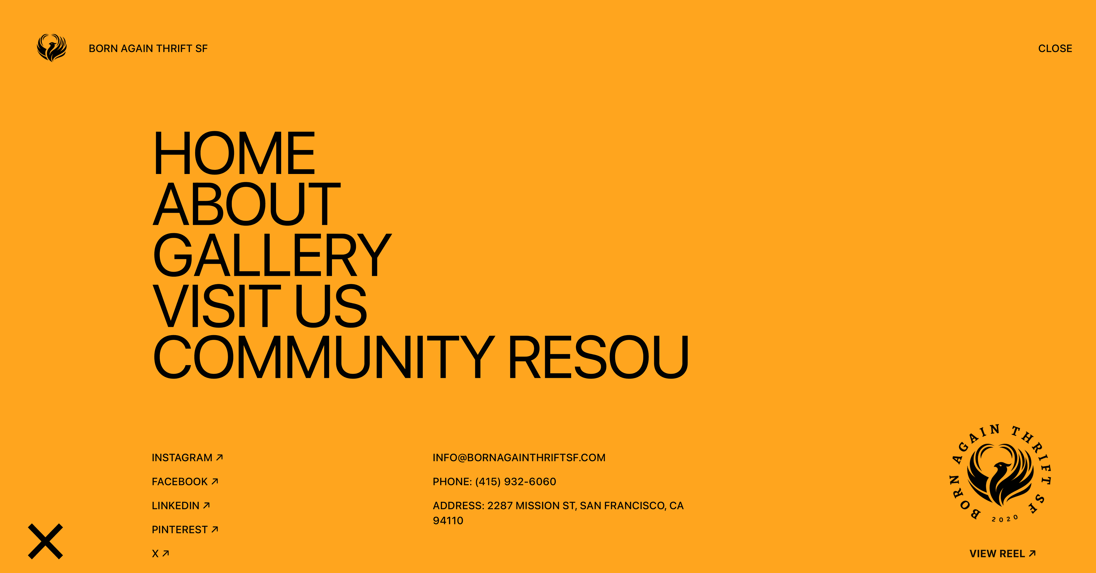
Gallery-heavy homepage with curated visual pacing
Infinite-style browsing pattern for exploration (implemented with performance guardrails)
Responsive typography and spacing that holds up on small screens
Brand-forward preloader/logo animation concepts to set tone on arrival
Minimal editorial copy that supports the photography
Technical highlights
- Responsive grids that re-balance imagery vs copy by breakpoint
- Motion for brand moments (entrances, loaders) with reduced-motion respect in mind
- Image pipeline decisions to avoid massive payloads in galleries
- Componentized gallery primitives to swap assets without refactors
Challenges & mitigations
Challenge
Image-heavy pages can tank mobile performance quickly.
How we approached it
Sized media to layout, used Next/Image patterns, and avoided loading full-resolution assets in lists.
Challenge
A distinctive brand risked becoming noisy.
How we approached it
Anchored the design to a simple type scale and a tight neutral palette—letting photos carry saturation.
Challenge
Motion can distract from shopping intent.
How we approached it
Limited animation to onboarding and section transitions; kept product discovery paths obvious.
Challenge
Local storytelling can feel generic if the visuals are weak.
How we approached it
Structured layouts around authentic store photography and short, specific copy tied to SF neighborhood context.
Results & impact
Framing below stays qualitative on purpose—swap in concrete numbers only when you can cite them.
- A memorable site posture that matches a physical shop personality
- A browsing experience that rewards exploration without overwhelming navigation
- Better readiness for seasonal campaigns and new drops (layout modularity)
- Stronger brand consistency across channels (qualitative)