Overview
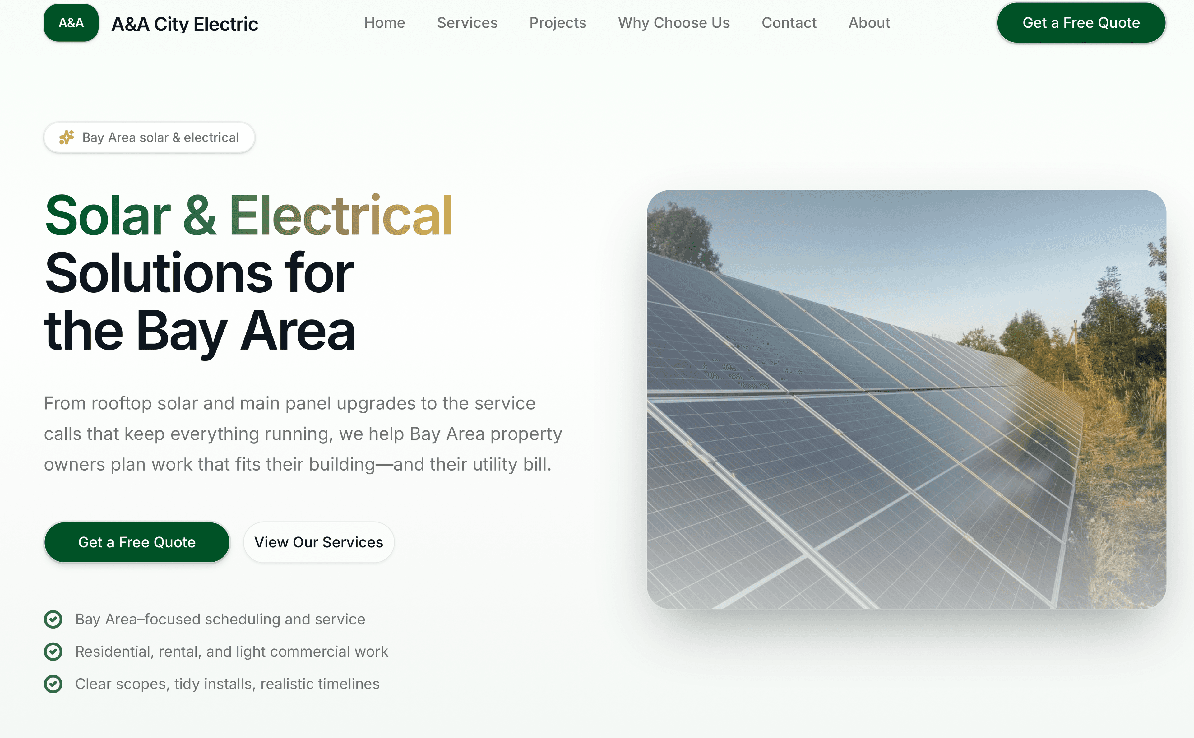
Built a marketing-forward site for a solar and electrical contractor: strong first impression, services that scan quickly, and performance-minded media so the brand reads “premium operator”, not “generic template”.
Role
Frontend developer · design implementation
Problem
Trade contractors need instant credibility: hero proof, clear services, and trust signals. The site had to feel modern, load fast, and scale as new photography and project stories arrive.
Solution
Implemented a responsive hero with strong visual hierarchy, service sections engineered for scanning, and Cloudinary-backed imagery with sensible defaults for compression and sizing. Motion is used sparingly to guide attention—not decorate every block.
Key features
Responsive hero with clear primary call-to-action paths
Service grid optimized for skimming on mobile
Trust-building layout patterns (clarity over hype)
Foundation for a richer project gallery as assets mature
Animation used as feedback and narrative pacing, not distraction
Technical highlights
- Next.js structure suited for incremental content growth
- Tailwind-driven design system aligned with the portfolio’s zinc/indigo language
- Motion-driven micro-interactions on headings and key CTAs
- Image optimization workflow via Cloudinary delivery URLs
- Lighthouse-oriented iteration on layout shifts and media weight
Challenges & mitigations
Challenge
Balancing a bold hero with fast first paint on real devices.
How we approached it
Prioritized LCP elements, tuned image dimensions/format priorities, and deferred non-critical animation until after first render where helpful.
Challenge
Keeping the story readable for non-technical visitors.
How we approached it
Short section intros, strong headings, and consistent spacing rhythm so scanning beats reading walls of text.
Challenge
Preparing for a growing gallery without a one-off rebuild later.
How we approached it
Structured repeatable “card” and grid primitives so new projects can slot in as components and data.
Results & impact
Framing below stays qualitative on purpose—swap in concrete numbers only when you can cite them.
- A professional storefront for a high-stakes local service category
- Improved perceived quality vs generic builder sites (qualitative feedback)
- A media pipeline that scales as the team adds project photography
- Cleaner performance headroom for future landing pages and expansions